프로젝트에서 사용할 공통 컴포넌트를 제작하는 ui 패키지를 만들었다
Directory
components: Button, Input 과 같은 컴포넌트가 있는 폴더
hooks: custom hook을 관리할 폴더
styles: reset.css palette.css 등 공통 css 를 관리할 폴더
types: helper type이 있는 폴더
Style
https://vanilla-extract.style/ 를 이용하여 스타일을 설정하였습니다
vanilla-extract의 장점으로
type safe하게 theme를 다룰 수 있습니다.
프론트앤드 프레임워크에 구애받지 않습니다.
Tailwind 처럼 Atomic CSS를 구성할 수도 있습니다.
Sttitches 처럼 variant 기반 스타일링을 구성할 수 있습니다.
Bundle
rollup 을 이용해서 번들링을 하였습니다
// rollup.config.js
import { vanillaExtractPlugin } from '@vanilla-extract/rollup-plugin';
import rollupResolve from '@rollup/plugin-node-resolve';
import commonjs from '@rollup/plugin-commonjs';
import typescript from 'rollup-plugin-typescript2';
import peerDepsExternal from 'rollup-plugin-peer-deps-external';
import preserveDirective from 'rollup-plugin-preserve-directives';
import dts from 'rollup-plugin-dts';
import pkg from './package.json' assert { type: 'json' };

const external = [...Object.keys(pkg.dependencies || {}), ...Object.keys(pkg.peerDependencies || {})];

/**
 * @type {import('rollup').RollupOptions}
 */
const config = [
  {
    input: 'src/index.ts',
    output: [
      {
        file: pkg.types,
        format: 'esm',
      },
    ],
    plugins: [dts()],
    external,
  },
  {
    input: 'src/index.ts',
    output: [
      {
        dir: 'dist',
        format: 'esm',
        exports: 'named',
        banner: arg => (/components\/[^/]+\/index.js/.test(arg.fileName) ? `'use client'` : ''),
        preserveModules: true,
        preserveModulesRoot: 'src',
        assetFileNames(assetInfo) {
          const assetPath = assetInfo.name.replace(/^src\//, 'css/');
          return assetPath;
        },
      },
    ],
    external,
    treeshake: {
      moduleSideEffects: false,
    },
    plugins: [
      vanillaExtractPlugin(),
      rollupResolve(),
      commonjs({ include: /node_modules/ }),
      typescript({ useTsconfigDeclarationDir: true }),
      peerDepsExternal(),
      preserveDirective(),
    ],
  },
];

export default config;
use client banner를 추가하여 next app router에서도 사용할수 있게 설정하였고
vanilla-extract css 관련파일은 css dir하위로 생성하게 설정하였습니다
post build 단계에서 다음 스크립트를 실행시켜 index.css파일을 생성한뒤 사용하는 프로젝트에서 css파일을 로드시키는것으로 하였습니다
// scripts/postbuild.js
import path from 'path';
import fs from 'fs';

function getAllFiles(dirPath, filesArray = []) {
  const files = fs.readdirSync(dirPath);

  files.forEach(file => {
    const filePath = path.join(dirPath, file);
    if (fs.statSync(filePath).isDirectory()) {
      getAllFiles(filePath, filesArray);
    } else {
      filesArray.push(filePath);
    }
  });

  return filesArray;
}
const vanillaCssList = getAllFiles('dist/css');

const contents = vanillaCssList.map(filePath => fs.readFileSync(filePath, 'utf8')).join('\n\n');
fs.writeFileSync('dist/css/index.css', contents);
// package.json
{
"name": "@breadlee/ui",
"version": "0.0.4",
"main": "./dist/index.js",
"module": "./dist/index.js",
"types": "./dist/index.d.ts",
"sideEffects": false,
"type": "module",
"license": "MIT",
"description": "",
"files": [
"dist/**"
],
"scripts": {
"prebuild": "[ ! -d dist ] && mkdir -p dist || rm -rf dist/*",
"build": "rollup --config",
"postbuild": "node scripts/postbuild.js && pnpm run minify",
"minify": "cleancss -o ./dist/css/index.css ./dist/css/index.css",
"typecheck": "tsc -b tsconfig.json"
},
"peerDependencies": {
"react": "^18.2.0",
"react-dom": "^18.2.0"
},
"devDependencies": {
"@breadlee/eslint-config": "workspace:*",
"@breadlee/icons": "workspace:*",
"@breadlee/tsconfig": "workspace:*",
"@breadlee/utils": "workspace:^",
"@rollup/plugin-commonjs": "^25.0.7",
"@rollup/plugin-node-resolve": "^15.2.3",
"@types/node": "^20.11.7",
"@types/react": "^18.2.55",
"@types/react-dom": "^18.2.19",
"@vanilla-extract/css": "^1.14.1",
"@vanilla-extract/rollup-plugin": "^1.3.4",
"clean-css-cli": "^5.6.3",
"eslint": "^8.56.0",
"rollup": "^4.9.6",
"rollup-plugin-dts": "^6.1.0",
"rollup-plugin-peer-deps-external": "^2.2.4",
"rollup-plugin-preserve-directives": "^0.4.0",
"rollup-plugin-typescript2": "^0.36.0",
"typescript": "^5.3.3"
},
"publishConfig": {
"access": "public"
}
}
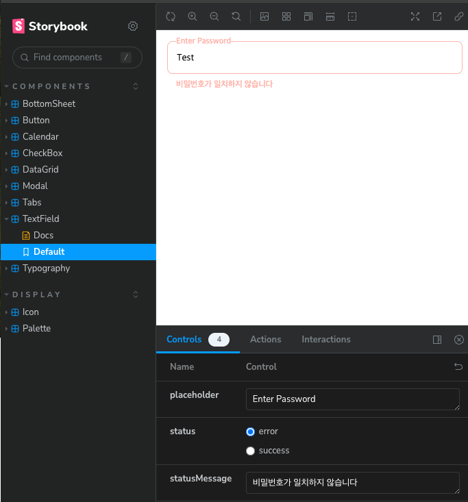
Component
다음 �Button 컴포넌트와 같이 컴포넌트를 components하위에 개발할 예정입니다.
// src/components/Button/index.tsx
import { ComponentPropsWithoutRef, ElementType, ReactNode, useMemo } from 'react';
import { classnames } from '@breadlee/utils';
import Typography, { TypographyProps } from '../Typography';
import styles from './index.css';
interface ButtonOwnProps {
children: ReactNode;
color?: 'primary' | 'secondary' | 'tertiary' | 'error';
size?: 'xlarge' | 'large' | 'medium' | 'small';
isFullWidth?: boolean;
typographyProps?: Omit<TypographyProps, 'children'>;
}
export type ButtonProps<E extends ElementType = 'button'> = ButtonOwnProps &
Omit<ComponentPropsWithoutRef<E>, keyof ButtonOwnProps> & { component?: E };
const Button = <E extends ElementType = 'button'>({
children,
color = 'primary',
component,
isFullWidth,
size = 'medium',
typographyProps,
...otherProps
}: ButtonProps<E>) => {
const Component = component || 'button';
if (component && !(otherProps.href || otherProps.to)) {
throw new Error('anchor tag 또는 button tag 만 올수있습니다');
}
const defaultTypographyProps = useMemo<ButtonProps['typographyProps']>(() => {
switch (size) {
case 'xlarge':
return {
weight: 'regular',
variant: 'B1',
};
case 'large':
return {
weight: 'regular',
variant: 'B2',
};
case 'small':
return {
weight: 'regular',
variant: 'D2',
};
default:
return {
weight: 'regular',
variant: 'B2',
};
}
}, [size]);
return (
<Component
className={classnames(styles.base, styles.color[color], styles.size[size], {
[styles.fullWidth]: !!isFullWidth,
})}
{...(Component === 'button' && { type: 'button' })}
{...otherProps}
>
{typeof children === 'string' ? (
<Typography {...defaultTypographyProps} {...typographyProps}>
{children}
</Typography>
) : (
children
)}
</Component>
);
};
export default Button;
// src/components/Button/index.css.ts
import { style } from '@vanilla-extract/css';
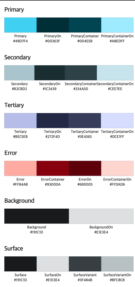
import { palette } from '../../styles';
const base = style({
display: 'inline-flex',
alignItems: 'center',
textAlign: 'center',
justifyContent: 'center',
padding: '0 24px',
borderRadius: 8,
});
const fullWidth = style({
width: '100%',
});
const size = {
xlarge: style({
height: 52,
}),
large: style({
height: 48,
}),
medium: style({
height: 40,
}),
small: style({
height: 32,
borderRadius: 4,
padding: '0 12px',
}),
};
const color = {
primary: style({
backgroundColor: palette.Primary,
border: `1px solid ${palette.Primary}`,
color: palette.PrimaryOn,
':active': {
backgroundColor: palette.PrimaryContainer,
border: `1px solid ${palette.PrimaryContainer}`,
color: palette.PrimaryContainerOn,
},
':disabled': {
backgroundColor: palette.Gray500,
border: `1px solid ${palette.Gray500}`,
},
}),
secondary: style({
backgroundColor: palette.Secondary,
border: `1px solid ${palette.Secondary}`,
color: palette.SecondaryOn,
':active': {
backgroundColor: palette.SecondaryContainer,
border: `1px solid ${palette.SecondaryContainer}`,
color: palette.SecondaryContainerOn,
},
':disabled': {
backgroundColor: palette.Gray500,
border: `1px solid ${palette.Gray500}`,
},
}),
tertiary: style({
backgroundColor: palette.Tertiary,
border: `1px solid ${palette.Tertiary}`,
color: palette.TertiaryOn,
':active': {
backgroundColor: palette.TertiaryContainer,
border: `1px solid ${palette.TertiaryContainer}`,
color: palette.TertiaryContainerOn,
},
':disabled': {
backgroundColor: palette.Gray500,
border: `1px solid ${palette.Gray500}`,
},
}),
error: style({
backgroundColor: palette.Error,
border: `1px solid ${palette.Error}`,
color: palette.ErrorOn,
':active': {
backgroundColor: palette.ErrorContainer,
border: `1px solid ${palette.ErrorContainer}`,
color: palette.ErrorContainerOn,
},
':disabled': {
backgroundColor: palette.Gray500,
border: `1px solid ${palette.Gray500}`,
},
}),
};
const buttonStyle = {
base,
fullWidth,
size,
color,
};
export default buttonStyle;
자세한 소스는 여기서 확인가능합니다
https://github.com/leeyc924/leeyc-package/tree/main/packages/ui