storybook은 React, Angular, Vue 등의 분리된 UI 컨포넌트를 체계적이고 효율적으로 구축할 수 있는 개발 도구입니다

UI 컨포넌트 라이브러리의 문서화(documentation)를 위해 사용할 수도 있고 디자인 시스템(Design system)을 개발하기 위한 플랫폼으로 사용할 수도 있습니다.

Directory

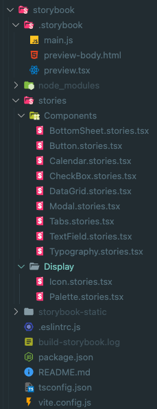
vite 기반으로 프로젝트를 구성하였습니다

.storybook: storybook config 관련 파일들이 있습니다

stories:

  • Components: @breadlee/ui 에서 개발한 컴포넌트들의 story들입니다 
  • Display: Icon, Palette 등 display용도의 story입니다

storybook-static: storybook build시 생성되는 정적 파일들입니다

Config

// .storybook/main.js
import { mergeConfig } from "vite";
import { resolve } from 'path';
const UI_PATH = resolve("../../packages/ui");

/** @type { import('@storybook/react-vite').StorybookConfig } */
const config = {
  stories: ["../stories/**/*.stories.@(js|jsx|mjs|ts|tsx|mdx)"],
  addons: [
    "@storybook/addon-links",
    "@storybook/addon-essentials",
    "@storybook/addon-interactions",
  ],
  framework: {
    name: "@storybook/react-vite",
    options: {},
  },
  docs: {
    autodocs: true,
  },
  async viteFinal(config) {
    return mergeConfig({
      ...config,
      resolve: {
        alias: [
          {
            find: '@styles',
            replacement: `${UI_PATH}/src/styles`
          },
          {
            find: "@components",
            replacement: `${UI_PATH}/src/components`,
          },
          {
            find: "@types",
            replacement: `${UI_PATH}/src/types`,
          },
          {
            find: "@hooks",
            replacement: `${UI_PATH}/src/hooks`,
          },
          {
            find: "@icons",
            replacement: resolve("../../packages/icons/dist"),
          },
        ],
      },
      define: {
        "process.env": {},
      },
      css: {
        postcss: null,
      },
    });
  },
};

export default config;

Example

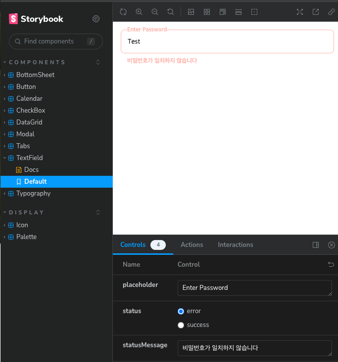
// Components/TextField.stories.tsx
import { TextField, TextFieldProps } from '@components';
import { Meta, StoryObj } from '@storybook/react';

const story: Meta<TextFieldProps> = {
  component: TextField,
  tags: ['autodocs'],
  parameters: {},
};

export default story;

export const Default: StoryObj<TextFieldProps> = {
  args: {
    placeholder: 'TextField',
  },
};

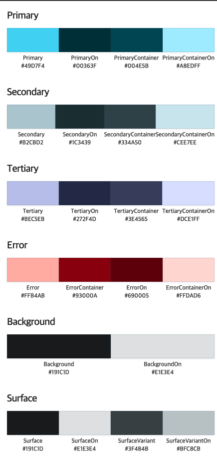
palette는 mdx로 작성할수도있지만 직접 story를 작성하였습니다

// Display/Palette.stories.tsx
import { Typography } from '@components';
import { Meta, StoryObj } from '@storybook/react';
import { palette } from '@styles';
import { useEffect, useRef, useState } from 'react';

interface PaletteProps {
  color?: keyof typeof palette;
}

const ColorItem = ({ className, name }: { name: string; className: string }) => {
  const [color, setColor] = useState<string>('');
  const ref = useRef<HTMLDivElement>(null);
  useEffect(() => {
    if (ref.current) {
      const computedStyle = getComputedStyle(ref.current);
      const color = computedStyle.getPropertyValue('background-color');
      const regex = /(\d+), (\d+), (\d+)/;
      const match = color.match(regex);
      if (!match) return;

      const r = parseInt(match[1]).toString(16).padStart(2, '0').toUpperCase();
      const g = parseInt(match[2]).toString(16).padStart(2, '0').toUpperCase();
      const b = parseInt(match[3]).toString(16).padStart(2, '0').toUpperCase();

      setColor(`#${r}${g}${b}`);
    }
  }, [className]);

  return (
    <div key={name} style={{ display: 'flex', flexDirection: 'column', flex: 1, gap: 5 }}>
      <div
        ref={ref}
        style={{
          backgroundColor: className,
          width: '100%',
          height: '48px',
          boxShadow: 'rgba(0, 0, 0, 0.1) 0 1px 3px 0',
          border: '1px solid hsla(203, 50%, 30%, 0.15)',
        }}
      ></div>
      <div style={{ display: 'flex', flexDirection: 'column', alignItems: 'center' }}>
        <Typography color="Gray800" variant="D2">
          {name}
        </Typography>
        <Typography color="Gray800" variant="D2">
          {color}
        </Typography>
      </div>
    </div>
  );
};

const ColorItemList = ({ title }: { title: string }) => {
  const colors = Object.entries(palette).filter(([name]) => name.includes(title));

  return (
    <div style={{ display: 'flex', flexDirection: 'column', gap: 10 }}>
      <div>
        <Typography color="Gray900" variant="H4">
          {title}
        </Typography>
      </div>
      <div style={{ display: 'flex', flex: 1 }}>
        {colors.map(([name, className]) => (
          <ColorItem className={className} key={name} name={name} />
        ))}
      </div>
    </div>
  );
};

const Palette = () => {
  return (
    <div style={{ display: 'flex', flexDirection: 'column', gap: 30 }}>
      <ColorItemList title="Primary" />
      <ColorItemList title="Secondary" />
      <ColorItemList title="Tertiary" />
      <ColorItemList title="Error" />
      <ColorItemList title="Background" />
      <ColorItemList title="Surface" />
      <ColorItemList title="Blue" />
      <ColorItemList title="Gray" />
      <ColorItemList title="Black" />
      <ColorItemList title="White" />
    </div>
  );
};

const story: Meta<PaletteProps> = {
  component: Palette,
  parameters: {
    docs: {
      description: {
        component: 'Display palette',
      },
    },
  },
};

export default story;

export const Default: StoryObj = {
  render() {
    return <Palette />;
  },
};

Publish

배포는 chromatic을 활용하여 배포해주었습니다

https://65d092e55038add0e921289f-xwvphhjnrf.chromatic.com/


@storybook/cli - Storybook


65d092e55038add0e921289f-xwvphhjnrf.chromatic.com


자세한 소스는 여기서 확인가능합니다

https://github.com/leeyc924/leeyc-package/tree/main/apps/storybook


'SideProject > Design System' 카테고리의 다른 글

6. utils  (2) 2024.02.18
5. ui  (5) 2024.02.13
4. icon  (5) 2024.02.08
3. npm publish  (2) 2024.02.02
2. eslint, tsconifg 설정  (3) 2024.02.01

매번 프로젝트마다 utility 함수를 만들기는 매우 번거로운 일입니다.


Directory


typescript 로 작성하였으며 src하위에 추가할 예정입니다

Bundle

tsup을 이용하여 간단하게 번들링하였습니다

// tsup.config.js
import { defineConfig } from 'tsup';

export default defineConfig({
  entry: ['src/index.ts'],
  format: ['esm'],
  dts: true,
  splitting: false,
  sourcemap: true,
  clean: true,
  minify: true,
});


parse.ts를 예를 들어 살펴 보겠습니다

// src/parse.ts

export function parseToNumber<T>(value: T, defaultValue = 0): number {
  const parsed = Number(value);

  if (Number.isNaN(parsed)) {
    return defaultValue;
  }

  return parsed;
}

value parameter를 number타입으로 변경 시켜주는 함수입니다


자세한 소스는 여기서 확인가능합니다

https://github.com/leeyc924/leeyc-package/tree/main/packages/utils

'SideProject > Design System' 카테고리의 다른 글

7. Storybook  (3) 2024.02.23
5. ui  (5) 2024.02.13
4. icon  (5) 2024.02.08
3. npm publish  (2) 2024.02.02
2. eslint, tsconifg 설정  (3) 2024.02.01

프로젝트에서 사용할 공통 컴포넌트를 제작하는 ui 패키지를 만들었다


Directory


components: Button, Input 과 같은 컴포넌트가 있는 폴더

hooks: custom hook을 관리할 폴더

styles: reset.css palette.css 등 공통 css 를 관리할 폴더

types: helper type이 있는 폴더

Style

https://vanilla-extract.style/를 이용하여 스타일을 설정하였습니다


vanilla-extract의 장점으로

  • type safe하게 theme를 다룰 수 있습니다.
  • 프론트앤드 프레임워크에 구애받지 않습니다.
  • Tailwind 처럼 Atomic CSS를 구성할 수도 있습니다.
  • Sttitches 처럼 variant 기반 스타일링을 구성할 수 있습니다.

Bundle

rollup 을 이용해서 번들링을 하였습니다


// rollup.config.js
import { vanillaExtractPlugin } from '@vanilla-extract/rollup-plugin';
import rollupResolve from '@rollup/plugin-node-resolve';
import commonjs from '@rollup/plugin-commonjs';
import typescript from 'rollup-plugin-typescript2';
import peerDepsExternal from 'rollup-plugin-peer-deps-external';
import preserveDirective from 'rollup-plugin-preserve-directives';
import dts from 'rollup-plugin-dts';
import pkg from './package.json' assert { type: 'json' };

const external = [...Object.keys(pkg.dependencies || {}), ...Object.keys(pkg.peerDependencies || {})];

/**
 * @type {import('rollup').RollupOptions}
 */
const config = [
  {
    input: 'src/index.ts',
    output: [
      {
        file: pkg.types,
        format: 'esm',
      },
    ],
    plugins: [dts()],
    external,
  },
  {
    input: 'src/index.ts',
    output: [
      {
        dir: 'dist',
        format: 'esm',
        exports: 'named',
        banner: arg => (/components\/[^/]+\/index.js/.test(arg.fileName) ? `'use client'` : ''),
        preserveModules: true,
        preserveModulesRoot: 'src',
        assetFileNames(assetInfo) {
          const assetPath = assetInfo.name.replace(/^src\//, 'css/');
          return assetPath;
        },
      },
    ],
    external,
    treeshake: {
      moduleSideEffects: false,
    },
    plugins: [
      vanillaExtractPlugin(),
      rollupResolve(),
      commonjs({ include: /node_modules/ }),
      typescript({ useTsconfigDeclarationDir: true }),
      peerDepsExternal(),
      preserveDirective(),
    ],
  },
];

export default config;

use client banner를 추가하여 next app router에서도 사용할수 있게 설정하였고

vanilla-extract css 관련파일은 css dir하위로 생성하게 설정하였습니다


post build 단계에서 다음 스크립트를 실행시켜 index.css파일을 생성한뒤 사용하는 프로젝트에서 css파일을 로드시키는것으로 하였습니다

// scripts/postbuild.js
import path from 'path';
import fs from 'fs';

function getAllFiles(dirPath, filesArray = []) {
  const files = fs.readdirSync(dirPath);

  files.forEach(file => {
    const filePath = path.join(dirPath, file);
    if (fs.statSync(filePath).isDirectory()) {
      getAllFiles(filePath, filesArray);
    } else {
      filesArray.push(filePath);
    }
  });

  return filesArray;
}
const vanillaCssList = getAllFiles('dist/css');

const contents = vanillaCssList.map(filePath => fs.readFileSync(filePath, 'utf8')).join('\n\n');
fs.writeFileSync('dist/css/index.css', contents);
// package.json
{
  "name": "@breadlee/ui",
  "version": "0.0.4",
  "main": "./dist/index.js",
  "module": "./dist/index.js",
  "types": "./dist/index.d.ts",
  "sideEffects": false,
  "type": "module",
  "license": "MIT",
  "description": "",
  "files": [
    "dist/**"
  ],
  "scripts": {
    "prebuild": "[ ! -d dist ] && mkdir -p dist || rm -rf dist/*",
    "build": "rollup --config",
    "postbuild": "node scripts/postbuild.js && pnpm run minify",
    "minify": "cleancss -o ./dist/css/index.css ./dist/css/index.css",
    "typecheck": "tsc -b tsconfig.json"
  },
  "peerDependencies": {
    "react": "^18.2.0",
    "react-dom": "^18.2.0"
  },
  "devDependencies": {
    "@breadlee/eslint-config": "workspace:*",
    "@breadlee/icons": "workspace:*",
    "@breadlee/tsconfig": "workspace:*",
    "@breadlee/utils": "workspace:^",
    "@rollup/plugin-commonjs": "^25.0.7",
    "@rollup/plugin-node-resolve": "^15.2.3",
    "@types/node": "^20.11.7",
    "@types/react": "^18.2.55",
    "@types/react-dom": "^18.2.19",
    "@vanilla-extract/css": "^1.14.1",
    "@vanilla-extract/rollup-plugin": "^1.3.4",
    "clean-css-cli": "^5.6.3",
    "eslint": "^8.56.0",
    "rollup": "^4.9.6",
    "rollup-plugin-dts": "^6.1.0",
    "rollup-plugin-peer-deps-external": "^2.2.4",
    "rollup-plugin-preserve-directives": "^0.4.0",
    "rollup-plugin-typescript2": "^0.36.0",
    "typescript": "^5.3.3"
  },
  "publishConfig": {
    "access": "public"
  }
}


Component

다음 Button 컴포넌트와 같이 컴포넌트를 components하위에 개발할 예정입니다.

// src/components/Button/index.tsx

import { ComponentPropsWithoutRef, ElementType, ReactNode, useMemo } from 'react';
import { classnames } from '@breadlee/utils';
import Typography, { TypographyProps } from '../Typography';
import styles from './index.css';

interface ButtonOwnProps {
  children: ReactNode;
  color?: 'primary' | 'secondary' | 'tertiary' | 'error';
  size?: 'xlarge' | 'large' | 'medium' | 'small';
  isFullWidth?: boolean;
  typographyProps?: Omit<TypographyProps, 'children'>;
}

export type ButtonProps<E extends ElementType = 'button'> = ButtonOwnProps &
  Omit<ComponentPropsWithoutRef<E>, keyof ButtonOwnProps> & { component?: E };

const Button = <E extends ElementType = 'button'>({
  children,
  color = 'primary',
  component,
  isFullWidth,
  size = 'medium',
  typographyProps,
  ...otherProps
}: ButtonProps<E>) => {
  const Component = component || 'button';

  if (component && !(otherProps.href || otherProps.to)) {
    throw new Error('anchor tag 또는 button tag 만 올수있습니다');
  }

  const defaultTypographyProps = useMemo<ButtonProps['typographyProps']>(() => {
    switch (size) {
      case 'xlarge':
        return {
          weight: 'regular',
          variant: 'B1',
        };
      case 'large':
        return {
          weight: 'regular',
          variant: 'B2',
        };
      case 'small':
        return {
          weight: 'regular',
          variant: 'D2',
        };
      default:
        return {
          weight: 'regular',
          variant: 'B2',
        };
    }
  }, [size]);

  return (
    <Component
      className={classnames(styles.base, styles.color[color], styles.size[size], {
        [styles.fullWidth]: !!isFullWidth,
      })}
      {...(Component === 'button' && { type: 'button' })}
      {...otherProps}
    >
      {typeof children === 'string' ? (
        <Typography {...defaultTypographyProps} {...typographyProps}>
          {children}
        </Typography>
      ) : (
        children
      )}
    </Component>
  );
};

export default Button;

// src/components/Button/index.css.ts

import { style } from '@vanilla-extract/css';
import { palette } from '../../styles';

const base = style({
  display: 'inline-flex',
  alignItems: 'center',
  textAlign: 'center',
  justifyContent: 'center',
  padding: '0 24px',
  borderRadius: 8,
});

const fullWidth = style({
  width: '100%',
});

const size = {
  xlarge: style({
    height: 52,
  }),
  large: style({
    height: 48,
  }),
  medium: style({
    height: 40,
  }),
  small: style({
    height: 32,
    borderRadius: 4,
    padding: '0 12px',
  }),
};

const color = {
  primary: style({
    backgroundColor: palette.Primary,
    border: `1px solid ${palette.Primary}`,
    color: palette.PrimaryOn,

    ':active': {
      backgroundColor: palette.PrimaryContainer,
      border: `1px solid ${palette.PrimaryContainer}`,
      color: palette.PrimaryContainerOn,
    },
    ':disabled': {
      backgroundColor: palette.Gray500,
      border: `1px solid ${palette.Gray500}`,
    },
  }),
  secondary: style({
    backgroundColor: palette.Secondary,
    border: `1px solid ${palette.Secondary}`,
    color: palette.SecondaryOn,

    ':active': {
      backgroundColor: palette.SecondaryContainer,
      border: `1px solid ${palette.SecondaryContainer}`,
      color: palette.SecondaryContainerOn,
    },
    ':disabled': {
      backgroundColor: palette.Gray500,
      border: `1px solid ${palette.Gray500}`,
    },
  }),
  tertiary: style({
    backgroundColor: palette.Tertiary,
    border: `1px solid ${palette.Tertiary}`,
    color: palette.TertiaryOn,

    ':active': {
      backgroundColor: palette.TertiaryContainer,
      border: `1px solid ${palette.TertiaryContainer}`,
      color: palette.TertiaryContainerOn,
    },
    ':disabled': {
      backgroundColor: palette.Gray500,
      border: `1px solid ${palette.Gray500}`,
    },
  }),
  error: style({
    backgroundColor: palette.Error,
    border: `1px solid ${palette.Error}`,
    color: palette.ErrorOn,

    ':active': {
      backgroundColor: palette.ErrorContainer,
      border: `1px solid ${palette.ErrorContainer}`,
      color: palette.ErrorContainerOn,
    },
    ':disabled': {
      backgroundColor: palette.Gray500,
      border: `1px solid ${palette.Gray500}`,
    },
  }),
};

const buttonStyle = {
  base,
  fullWidth,
  size,
  color,
};
export default buttonStyle;


자세한 소스는 여기서 확인가능합니다

https://github.com/leeyc924/leeyc-package/tree/main/packages/ui

'SideProject > Design System' 카테고리의 다른 글

7. Storybook  (3) 2024.02.23
6. utils  (2) 2024.02.18
4. icon  (5) 2024.02.08
3. npm publish  (2) 2024.02.02
2. eslint, tsconifg 설정  (3) 2024.02.01

오늘은 나만의 icon package를 제작하였습니다

fantasticon을 이용해서 icon svg 파일들을 webfont로 제작하여 publish 하였습니다


Directory


components: Icon컴포넌트가 위치한곳

constants: Icon의 name이 있는곳

icons: icon svg파일들이 있는곳

templates: webfont 추출시 필요한 template

Webfont generate 

피그마에서 다음과같이 svg 아이콘을 만든뒤

icons 폴더에 넣어주고

// fantasticonrc.json

{
  "inputDir": "./src/icons",
  "outputDir": "./dist",
  "normalize": true,
  "fontTypes": ["svg", "woff"],
  "assetTypes": ["css", "ts", "json"],
  "templates": {
    "css": "src/templates/css.hbs"
  }
}


// templates/css.hbs

@font-face {
    font-family: "{{ name }}";
    src: {{{ fontSrc }}};
    font-display: block;
}

i[class*=" {{ prefix }}-"]::before,
i[class^="{{ prefix }}-"]::before {
    font-family: {{ name }} !important;
    font-style: normal;
    font-weight: 400 !important;
    font-variant: normal;
    text-transform: none;
    line-height: 1;
    -webkit-font-smoothing: antialiased;
    -moz-osx-font-smoothing: grayscale;
}

{{# each codepoints}}
    .{{ ../prefix }}-{{ @key }}::before {
        content: "\\{{ codepoint this }}";
    }
{{/ each}}

fantasticon 설정파일과 hbs 템플릿 파일을 생성한뒤 npm fantasticon을 실행하면 woff 파일이 정상적으로 만들어집니다

Icon 컴포넌트 & Bundle

components 에는 리액트 코드에서 사용될 Icon 컴포넌트를 만든뒤 tsup 으로 번들링해주었습니다

import { CSSProperties } from 'react';
import icons from '../constants';

export interface IconProps {
  name: (typeof icons)[number];
  size?: number;
  irName?: string;
  color?: CSSProperties['color'];
}

const Icon = ({ color = '#000', irName, name, size = 24 }: IconProps) => {
  return (
    <i
      className={`icon icon-${name}`}
      style={{
        fontSize: size,
        color,
      }}
    >
      {irName && <span>{irName}</span>}
    </i>
  );
};

export default Icon;


아이콘의 이름을 props로 받기위해 constants.ts 파일을 생성해주는 script도 작성하였습니다

#!/bin/bash

icon_path='src/icons'
constant_file='src/constants/index.ts'

echo 'const icons = [' >"$constant_file"

function convert_name {
  file_name=$(basename "$1")
  file_name_without_extension="${file_name%.*}"
  dash_replaced="${file_name_without_extension// /-}"

  echo "$dash_replaced"
}

for file in "$icon_path"/*; do
  if [ -f "$file" ]; then
    converted_name=$(convert_name "$file")
    echo "  '${converted_name}'", >>"$constant_file"
  fi
done

{
  echo '] as const;'
  echo '' >>"$constant_file"
  echo 'export default icons' >>"$constant_file"
} >>"$constant_file"

npx eslint --fix "$constant_file"


그다음 npm tsup 을 하면 dist에 Icon컴포넌트가 정상적으로 번들링되는 모습을 확인할수있습니다

// tsup.config.js
import { defineConfig } from 'tsup';

export default defineConfig({
  entry: ['src/components/index.tsx'],
  format: ['esm', 'cjs'],
  dts: true,
  splitting: false,
  sourcemap: true,
  clean: true,
  minify: true,
});


그 다음 npm publish를 통해 npm 에 배포하면 끝

사용

import Icon from "@breadlee/icons";

function App() {
  return (
    <>
      아이콘 입니다
      <Icon name="arrow_down" color="red" size={24} />
    </>
  );
}

export default App;


icons.woff 파일과 icons.css파일 배포전략을 생각해봐야 할것같습니다

지금은 임시로 https://www.jsdelivr.com/?docs=gh 무료 cdn을 활용하여

<link href="https://cdn.jsdelivr.net/npm/@breadlee/icons/dist/icons.css" rel="stylesheet" />
<link
  as="font"
  crossOrigin="anonymous"
  href="https://cdn.jsdelivr.net/npm/@breadlee/icons/dist/icons.woff"
  rel="preload"
  type="font/woff"
/>

다음과 같이 불러와서 테스트하고 있습니다


자세한 소스는 여기서 확인가능합니다

https://github.com/leeyc924/leeyc-package/tree/main/packages/icons

'SideProject > Design System' 카테고리의 다른 글

6. utils  (2) 2024.02.18
5. ui  (5) 2024.02.13
3. npm publish  (2) 2024.02.02
2. eslint, tsconifg 설정  (3) 2024.02.01
1. Monorepo 구성  (2) 2024.02.01

이전 글에서 eslint tsconfig 파일을 구성하였으니 해당 파일을 publish하여 나의 어디 프로젝트는 사용할수 있게 할것이다


우선 npm login 을 해준다

npm login
>>> npm notice Log in on https://registry.npmjs.org/
>>> Login at:
>>> https://www.npmjs.com/login?next=/login/cli/...
>>> Press ENTER to open in the browser...

>>> Logged in on https://registry.npmjs.org/.


npm whoami
>>> leeyc924


npm publish을 하여 해당 패키지를 publish해준다

npm publish
>>> npm WARN publish npm auto-corrected some errors in your package.json when publishing.  Please run "npm pkg fix" to address these errors.
>>> npm WARN publish errors corrected:
>>> npm WARN publish Removed invalid "scripts"
>>> npm notice 
>>> npm notice 📦  @breadlee/tsconfig@0.0.1
>>> npm notice === Tarball Contents === 
>>> npm notice 695B base.json         
>>> npm notice 418B nextjs.json       
>>> npm notice 126B package.json      
>>> npm notice 166B react-library.json
>>> npm notice === Tarball Details === 
>>> npm notice name:          @breadlee/tsconfig                      
>>> npm notice version:       0.0.1                                   
>>> npm notice filename:      breadlee-tsconfig-0.0.1.tgz             
>>> npm notice package size:  711 B                                   
>>> npm notice unpacked size: 1.4 kB                                  
>>> npm notice shasum:        a99970836c3972e2760aa9e8bed1c6b1b8b28233
>>> npm notice integrity:     sha512-Q64V+mzjvrKF+[...]bFiZ8el1aLiVQ==
>>> npm notice total files:   4                                       
>>> npm notice 
>>> npm notice Publishing to https://registry.npmjs.org/ with tag latest and public access
>>> + @breadlee/tsconfig@0.0.1


'SideProject > Design System' 카테고리의 다른 글

6. utils  (2) 2024.02.18
5. ui  (5) 2024.02.13
4. icon  (5) 2024.02.08
2. eslint, tsconifg 설정  (3) 2024.02.01
1. Monorepo 구성  (2) 2024.02.01

1) eslint-config

eslint config 파일을 먼저 설정해 볼것이다 pnpm으로 프로젝트를 구성하여서 --filter option을  사용하여 root에서도 해당 패키지에 설치할수있다


우선 packages/eslint-config로 이동하여 package.json을 구성해준다 

{
  "name": "@breadlee/eslint-config",
  "version": "1.0.0",
  "description": "leeyc package eslint config 파일입니다",
  "main": "index.js",
  "publishConfig": {
    "access": "public"
  },
  "keywords": [],
  "author": "",
  "license": "ISC",
  "dependencies": {
  }
}

name 을 @leeyc/eslint-config로 설정해주면 pnpm --filter @leeyc/eslint-config로 해당 package로 설치를 할수있다


eslint설정에 필요한 패키지를 설치해준다

pnpm add @typescript-eslint/eslint-plugin @typescript-eslint/parser eslint-config-prettier eslint-config-turbo eslint-import-resolver-typescript eslint-plugin-import eslint-plugin-prettier eslint-plugin-react eslint-plugin-react-hooks eslint-plugin-sort-destructure-keys --filter @leeyc/eslint-config


index.js를 생성하고 eslint config 설정을 해준다

/** @type {import("eslint").Linter.Config} */
module.exports = {
  extends: [
    'plugin:react/recommended',
    ...
  ],
  plugins: ['react', '@typescript-eslint', 'import', 'sort-destructure-keys'],
  parserOptions: {
    ecmaFeatures: { jsx: true },
    ecmaVersion: 12,
    sourceType: 'module',
  },
  env: {
    browser: true,
    es2021: true,
    node: true,
  },
  settings: {
    'import/resolver': {
      typescript: {
        project: ['tsconfig.json', 'packages/*/tsconfig.json'],
      },
    },
  },
  ignorePatterns: ['node_modules/', 'dist/'],
  rules: {
     ...
    'prettier/prettier': [
      'error',
      {
        parser: 'typescript',
        singleQuote: true,
        printWidth: 120,
        tabWidth: 2,
        trailingComma: 'all',
        bracketSpacing: true,
        semi: true,
        useTabs: false,
        arrowParens: 'avoid',
        endOfLine: 'auto',
      },
    ],
  },
};


2) tsconfig

typescript config 파일도 eslint와 마찬가지로 package.json부터 설정해주고

{
  "name": "@breadlee/tsconfig",
  "version": "0.0.0",
  "private": true,
  "license": "MIT",
  "publishConfig": {
    "access": "public"
  }
}

js파일을 생성하여 필요한 tsconfig 설정들을 해준다

{
  "$schema": "https://json.schemastore.org/tsconfig",
  "display": "Default",
  "compilerOptions": {
    "target": "ES5",
    "lib": [
      "DOM",
      "DOM.Iterable",
      "ESNext"
    ],
    "composite": false,
    "declaration": true,
    "declarationMap": true,
    "esModuleInterop": true,
    "forceConsistentCasingInFileNames": true,
    "inlineSources": false,
    "isolatedModules": true,
    "module": "ESNext",
    "moduleResolution": "Node",
    "resolveJsonModule": true,
    "noUnusedLocals": false,
    "noUnusedParameters": false,
    "preserveWatchOutput": true,
    "skipLibCheck": true,
    "strict": true,
    "noEmit": true,
  },
  "exclude": [
    "node_modules"
  ]
}

3) root 설정

root 디렉토리에서 .eslintrc.js를 생성하여 다음과 같이 작성해준다

/** @type {import("eslint").Linter.Config} */
module.exports = {
  root: true,
  extends: ['@breadlee/eslint-config'],
};

eslint 가 제대로 설정된것을 확인한다


자세한 설정은 여기서 확인할수있다

https://github.com/leeyc924/leeyc-package

'SideProject > Design System' 카테고리의 다른 글

6. utils  (2) 2024.02.18
5. ui  (5) 2024.02.13
4. icon  (5) 2024.02.08
3. npm publish  (2) 2024.02.02
1. Monorepo 구성  (2) 2024.02.01

매번 프로젝트를 할떄마다 컴포넌트를 새로만들고 utility를 새로 만들고 하는 불편함이 있어 나만의 package를 구성하고 싶어 시작하게 된 프로젝트이다 그래도 최종 결과물이 있어야 하니까  design system까지 구성해보는것을 목표로 삼았다.

https://turbo.build/repo/docs를 이용해서 monorepo로 구성하여보았다


기술스택

react, typescript

tsup, vite, rollup

bash

turborepo


- apps
  - storybook
  ...
- packages
  - components
  - util
  - eslint-config
  - tsconfig
  - ui
  ...
script
  ...
package.json
pnpm-lock.yaml
pnpm-workspace.yaml
turbo.json

프로젝트 구조는 다음과 같이 잡았으며 package에서는 @leeyc/** 패키지를 개발하고 apps에서는 storybook 과같은 서버를 띄울 것 이다.


자세한 소스는 여기서 확인할수있다

https://github.com/leeyc924/leeyc-package

'SideProject > Design System' 카테고리의 다른 글

6. utils  (2) 2024.02.18
5. ui  (5) 2024.02.13
4. icon  (5) 2024.02.08
3. npm publish  (2) 2024.02.02
2. eslint, tsconifg 설정  (3) 2024.02.01

+ Recent posts